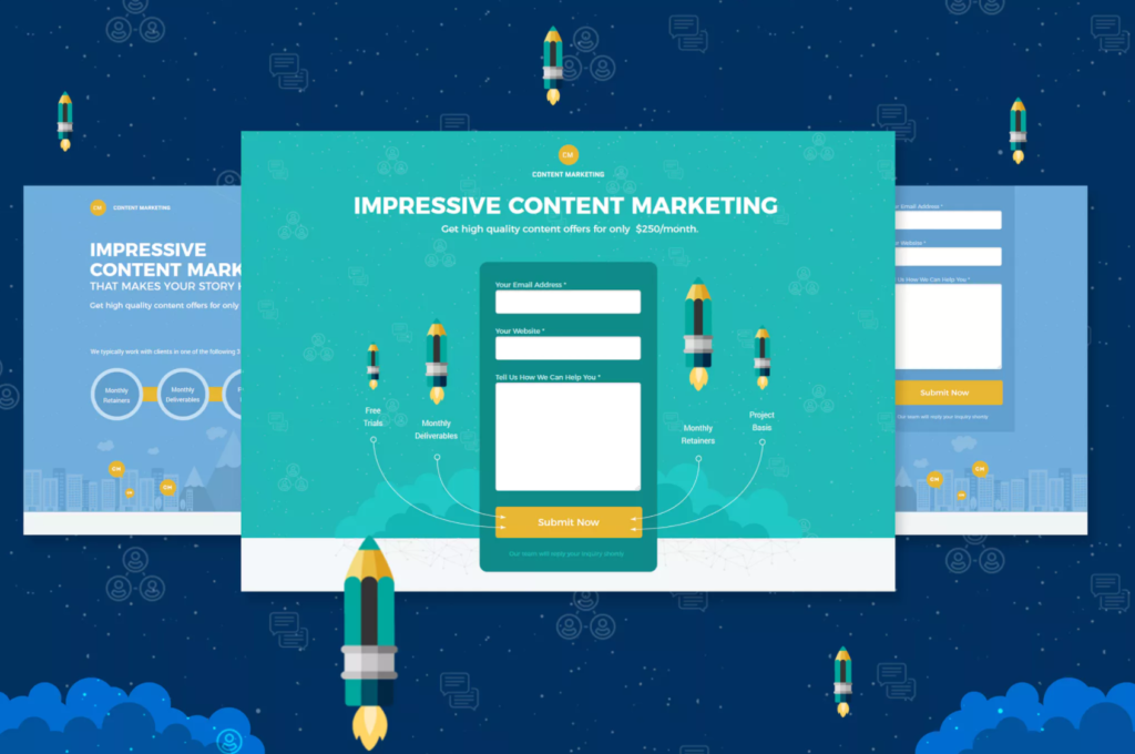
The internet abounds with online forms and surveys. Businesses use them to gather information, registrations, contacts, payments, and feedback from visitors, users, and customers.
However, it’s not always easy to get people’s attention on these forms as they get increasingly concerned about the privacy of information. And, people usually consider it a waste of time.
But you need your customers to take that action on your website, inside your app, or on your social network profile — so how can you make them feel like they’re not wasting their time?
Let’s analyze quickly the ways for you to create web forms that are attractive and easy to take. Because everyone likes attractive content and designs.
In the end, you will love the increase in your conversion and completion rates.
These are the top 6 tips distilled from our decade long experience with web forms:
Brief & clear, every field speaks for itself
Forms that see best completion rates are the ones that ask smartly.
Complicated and ambiguous questions are frustrating. Most form takers choose not to dwell on them and simply abandon the form. This is the worst-case scenario to avoid at all costs.
How to ask smartly?
First and foremost, field name must be clear and concise, try to make it self-explanatory. If the field name itself cannot provide enough context, you can always add brief explanation as a hover-over tooltip or plain text under the field.
Provide answers to your questions and let users choose between the options in a multiple choice or checkbox field. This will help speed up the process for them and provide you with clear answers to analyze later. Open-ended questions have proved to be a dead end for forms.
But, make sure you add below a simple textbox field for those who wish to give more reasons for their choice.
Make this field optional because not everyone is willing to talk wide and large on the subject. Those that do, however, will provide you with interesting insights that will complement your understanding of their choices.
Try to explain the fields, give them more context. What exactly is the information you’re looking for?
Finally, to reduce clutter and to make your form straightforward — use Logic Rules.
Logic rules allow you to adjust your form’s behavior based on form taker’s input, so that you show only relevant fields. These rules are usually easy to set up in any form builder you might want to use.
For example, if the field asks for user’s Sex and the answer is Female, you will show a different array of questions than you would if the answer was Male. These conditional paths are field and form rules that help you streamline your forms.
Mobile access
Make sure your form is easy to fill in on mobile devices. This supposes large text, fields and buttons, easy calendar choices, and general responsiveness to screen resolutions.
The less the merrier, questions and fields
Include only the most relevant fields that will give you enough information for your goal.
Consider omitting the fields that are not essential like landline phone number, date of birth, two address fields and so on.
Moreover, try avoiding CAPTCHA and use smart reCAPTCHA instead. The research has shown that a majority of users drops off here, especially if captcha is illegible and requires multiple attempts.
Compulsory vs optional fields?
If you intend on obtaining a nice-to-have information, make those fields optional. This especially applies to textual fields where you ask for additional explanations of previously chosen answers.
Validate and instruct
Consider including field validation and instructions.
Validate the length of credit card and phone number, phone prefix codes, date format, password strength, the accuracy of repeated password, limit the number of entries per ip address, and countries you accept.
Always state clearly in red next to the field as soon as error is made so that form takers don’t go through the trouble of filling in the whole form before they find out. If this happens, they will most likely abandon the form.
Some fields might require additional instructions, so make sure you add these as hover-over tooltips or textual explanations below the field name.
Don’t forget to appreciate and stay in touch
Once your form takers invest time in submitting your form, the least you can do is thank and reassure them that their submission has reached you.
Provide more information about the next steps (like shipping information, for example), list similar products and services, expand the story on your brand, offer loyalty programs or newsletter subscription. Your ultimate goal is to stay in touch with your customers and keep reminding them about your offer.
It’s smart to add call-to-action button to your Thank you page and confirmation email which can lead back to your website, a specialized landing page, or your blog. Why not add widgets to your social media profiles too and ask your audience to follow you if they liked your service?
Just like you did with the form itself, make your Thank you page and confirmation email attractive and personalized. You can achieve this by adding background images, custom fonts, buttons, links, tables, objects, symbols, and emoticons.
Play with visuals
Finally, remember to give due importance to the visual side of your form.
“According to the National Center for Biotechnology Information, the average customer’s attention span is 8 seconds, down from 12 seconds in 2000. That is officially less than the attention span of a goldfish (9 seconds).” – claim smart people from EyeQ in their text on The power of visual content.
Therefore, we need to rely more on visuals to get our message across and communicate complicated concepts hundreds of times faster and more effectively.
For your form this means interesting background images, your logo in the header, specific fonts and styles, and even custom HTML and CSS for those that can do some basic coding.
Our team at EmailMeForm offers custom form building service for those who need unique and outstanding forms. Check out our portfolio of beautiful forms.
—
Now you’re all set to get the best out of your forms! Try tweaking them as we advise and even do A/B tests to prove the effectiveness of the techniques explained above. Good luck and let us know how it worked out for you.
This post was contributed by Jovana, a content developer for EmailMeForm, an online form and survey builder. Educating users on how online forms impact business growth and productivity is what keeps her busy.