
Startup culture has become a solid fixture in the business world, all stemming from the demonstrable advantages of prioritizing flexibility and creativity without the traditional but stultifying hierarchy of authority— but the average startup lacks the steadying hand of oversight or the benefit of experienced advice, and that can make it difficult when it comes time to turn a promising idea into a practical branded solution that plays well to a general audience.
Visual psychology is a notably important element of product presentation, marketing, and interface design. How we perceive and interpret visual cues affects the overall conclusions we draw, the opinions we form, and the actions we take.
In short, your visual design makes a big difference to your general success. Are you running a startup but feel that you lack a solid grasp on how to handle it? Let’s take a look at some things you need to understand about visual psychology.
Color is Meaningful
Choosing what colors to use to represent a brand isn’t a trivial matter. There are so many strong color associations swimming around our minds that it’s always advisable to seek a thematic match between your aesthetic and the message you’re trying to send.
Red is the color of passion, for instance, but also anger. Yellow suggests optimism, but perhaps a carefree irresponsibility. Purple is noble and luxurious, but also enigmatic and temperamental. And the color combinations you use suggest something as well. Harmonious color palettes are calm and peaceful, while contrasting color palettes are harsh and disconcerting (you can use a palette tool to come up with strong combinations).
 Image credit: Max Pixel
Remember, though, that these associations mostly seem to be cultural in nature. For instance, we link gold the color to wealth because we link gold the element to wealth, just as we view green in a particular way because of how paper currency has long been colored. As such, don’t feel entirely bound by precedent; focus on the context of your content.
Rounding is Standard Practice
Rounding is dominant in modern interface design, and that’s because it’s firmly established that we prefer round shapes in most situations. They feel comfortable, highlight contents instead of pushing our attention away from them, and take up less space than their jagged-cornered equivalents.
You don’t want to overuse them, and sharp corners certainly have their place (particularly when looking to clearly delineate elements of an interface, such as sidebars or navigation rows), but they should be considered the default option for important things like call-to-action buttons.

Image credit: Pixabay
And if you really want to stand out as an unconventional brand, you can think about using totally different shapes, like bubbles, or clouds, or trapezoids. Just be aware of the effect it will have on usability. There’s no sense in cultivating a signature style if it results in your biggest links being missed, after all.
Contrast is Vital
This point goes for every other aspect we might cover, which is why it demands its own section; visual contrast is utterly essential for communicating to people what they’re supposed to be looking at and what elements can be left in the background.
We don’t read very closely at the best of times, and we’re not going to carefully scan through large quantities of text to discern where we’re intended to go and what actions we’re expected to take— it’s thought that we process visuals 60,000 times faster than text. We need visual cues to lead our attention in a manner that doesn’t require conscious consideration.
As such, you should size, color and style your visual elements in a manner that reflects their relative importance. Ensure that there is a great disparity between your highest-priority sections and those that contain nothing of any grand significance.
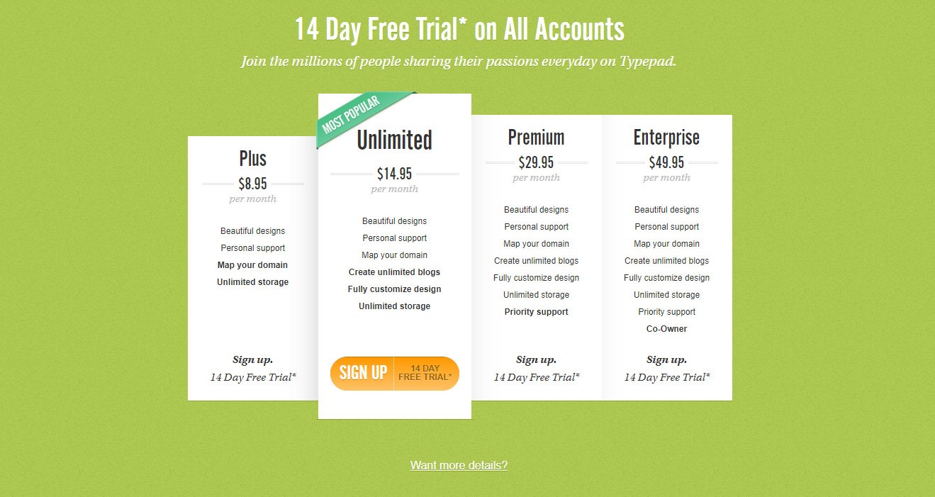
Image credit: Typepad
You can use this to subtly influence selections. If you list several options with one placed subtly more prominently somewhere in the middle, then having the freedom to choose between them will leave the user feeling less pressured to pick the option you want them to pick, meaning they’ll be less inclined to resist when their eye naturally drifts to the most prominent option.
Minimalism is Advisable
Clutter isn’t good, because our ability to comprehend information in any given moment is fairly limited. When we look at a chart, we don’t soak up everything at once; we run our eyes over it, taking it in piece by piece. The more dense the layout, the more likely it will be that something significant will be missed, and it’s unlikely to all be valuable. Think of it as a signal plus noise.
Take into account the need of digital media to be viable on the screens of various pocketable electronic devices, and you can only conclude that keeping layouts as simple and uncluttered as possible demands a lofty position in your list of design priorities. You’ll notice that many online stores use very similar clean interfaces— this is the result of a lot of thorough testing.
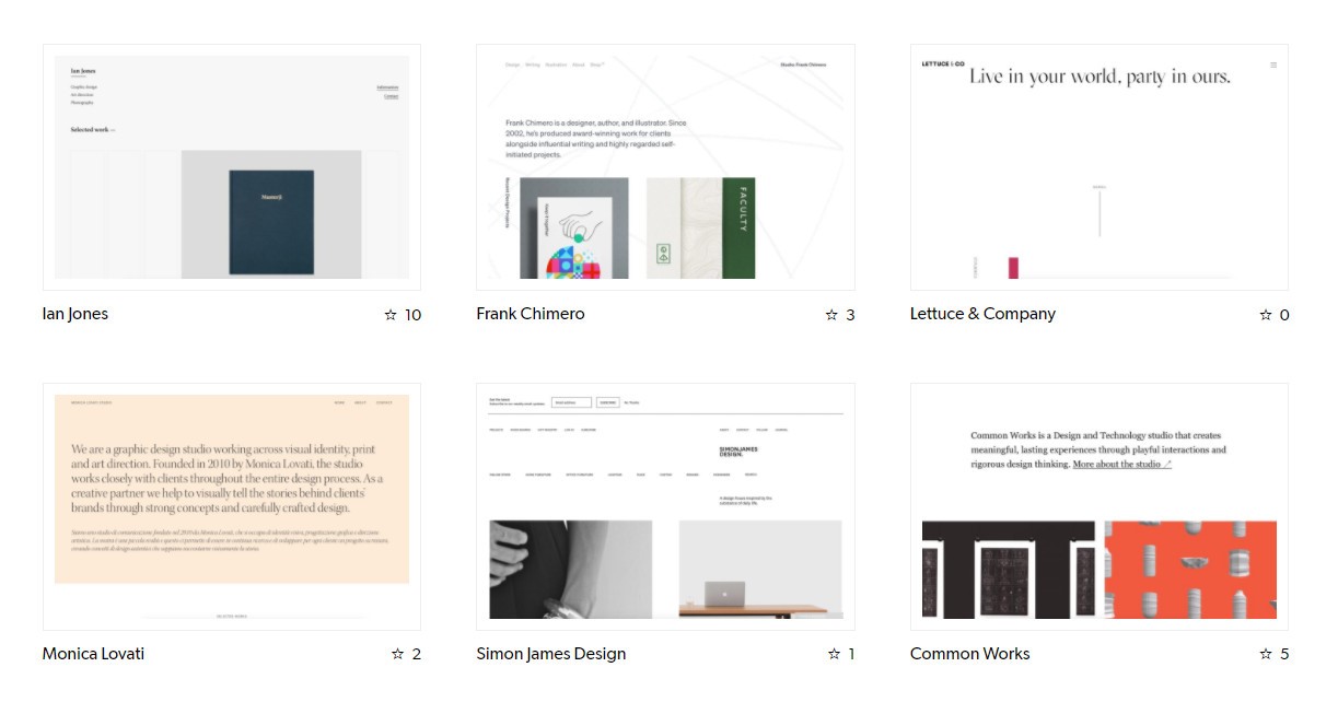
Image credit: Siiimple
To see some specific examples of how clean interfaces are implemented across different areas of business, you can browse some ecommerce businesses for sale; they’re sorted by category, so you can venture into particular retail avenues to see what the style standards are. Outside of ecommerce, try looking at Siiimple’s array of ultra-clean pared-down websites (pictured above).
Composition is Powerful
The rhetorical power of ratios has been understood for a long time. There are two arrangements that see a lot of use: the rule of thirds, and the golden ratio (roughly 1.618:1), with the former a decent general guide and the latter more difficult to implement but probably more compelling.
When you see a great photo, you instinctively know it to be great, but you might not be able to articulate why. This is often down to its composition, with its distribution of elements either accidentally (or, more likely, deliberately) corresponding with one of the aforementioned arrangements.
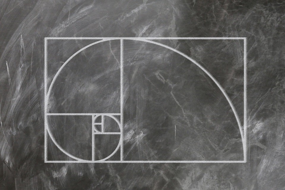
Image credit: Max Pixel
Why does the golden ratio work so well, and appear so frequently in nature? Well, we don’t know for sure, though many have theories. Designer Darrin Crescenzi suggests the following: “[it] is a powerful mathematical constant woven into the very fabric of biology. It is the unique visual tension between comforting symmetry and compelling asymmetry, and its thoughtful application can bring beauty and harmony and intrigue to all manner of designed things.”
How you represent yourself visually as a brand in your early days of operation has a significant effect on how you are ultimately perceived by your users, customers, and industry peers.If you don’t commit some time to understanding how people view and interpret visual data, you’ll find your content under-performing for unclear reasons.
Use these tips as a starting point, and continue to think about how your branded materials (most significantly your online platforms and documents) come across to your target audience. In doing so, you’ll give your company a great chance of outperforming your competitors without them even realizing how.
This post contributed by Victoria Greene, an ecommerce marketing expert and freelance writer who loves to see well-optimized visual designs. You can read more of her work at her blog Victoria Ecommerce.